
personal branding identity
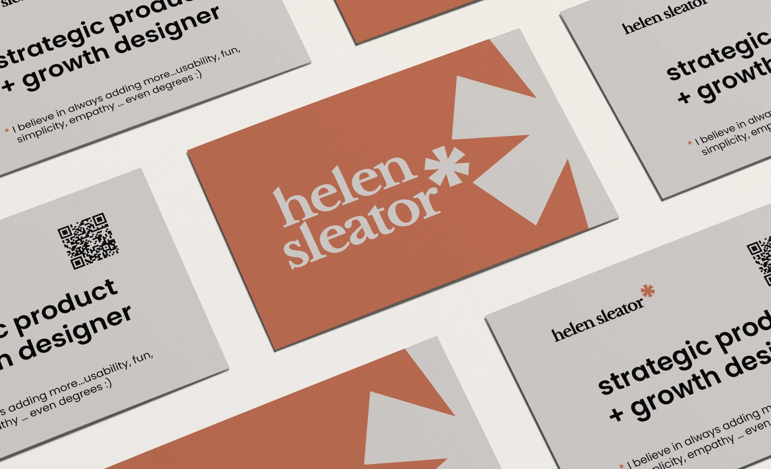
Multiple business cards and logo designs for Helen Sleator, with text including her name, the description "strategic product + growth designer," QR codes, and design elements in a modern style.
client: Personal Brand Identity
role: Creative Director
-
Personal Branding Identity
I set myself the challenge of creating a personal identity that reflects my role as a Strategic Product & Growth Designer with a marketing background. You, my dear reader, are the target audience (a little meta).
-
The challenge was to distill my skills and values into a cohesive identity that communicates both clarity and warmth. I needed to create a visual language that would resonate with recruiters, reflect my design philosophy, and remain flexible enough to grow with me.
-
As with any identity project, I began with strategy. I drilled down to my four brand values:
Empathy – I’m human-focused.
Usability – design should always work effortlessly.
Simplicity – clarity over clutter.
Fun – small sparks of delight.
With these in place, I moved to creative direction, developing three distinct but related moodboards:
Minimal Modern (Usability + Simplicity) – clean grids, calm rhythm, clay accent warmth.
Playful Professional (Fun + Empathy) – approachable typography, vibrant touches, friendly tone.
Calm Clarity (Simplicity + Empathy) – light, airy layouts, ocean-inspired hues, understated sophistication.
A key symbol emerged from this process: the asterisk. Grammatically, an asterisk is used to add more information to a sentence. Visually, I leaned into that metaphor — I always aim to add more: more usability, more simplicity, more empathy, even degrees.
At this point I locked in with moodboard one as my direction and decided to keep my name as the focus, developing a wordmark logo. I paired Libre Baskerville (to emphasise human warmth) with a Poppins asterisk for clarity and balance. To further embody my core value of simplifying, I customised the wordmark by slicing through the serif terminals at the ascenders, echoing the angled stroke of the asterisk for visual cohesion.
-
The result is the very site you’re reading now — a cohesive portfolio identity that balances professionalism with personality. Built within the constraints of Squarespace, it showcases my ability to apply brand strategy, UX thinking, and accessibility principles even to my own identity.
Graphic design with text 'brand identity development' on a background with geometric shapes.
An infographic slide with the title '2. brand strategy' in large text, with a stylized geometric background in shades of brown and white.
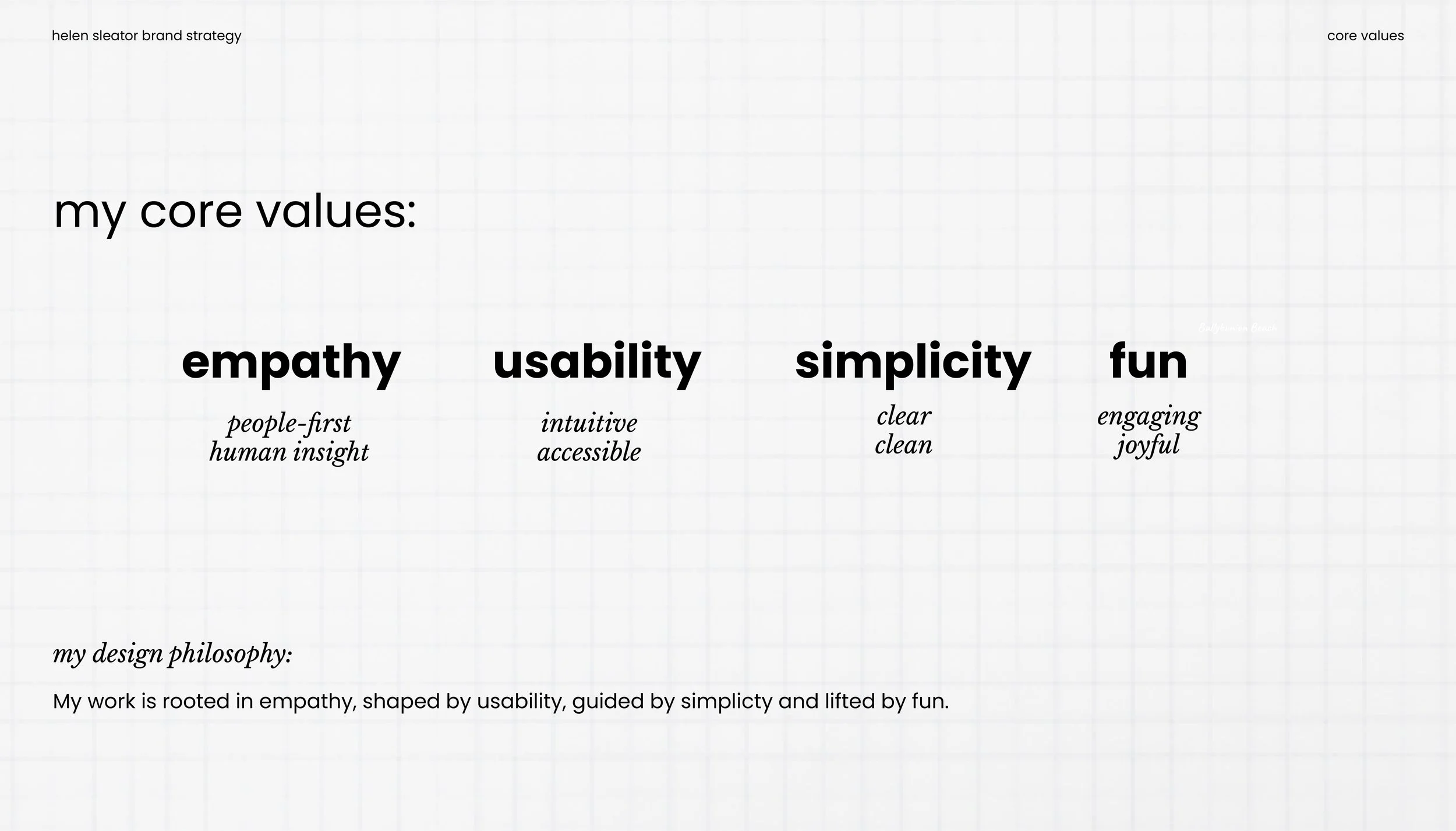
my core values
Slide with the text '3. creative direction' on a brown background and geometric shapes in shades of brown and light gray.
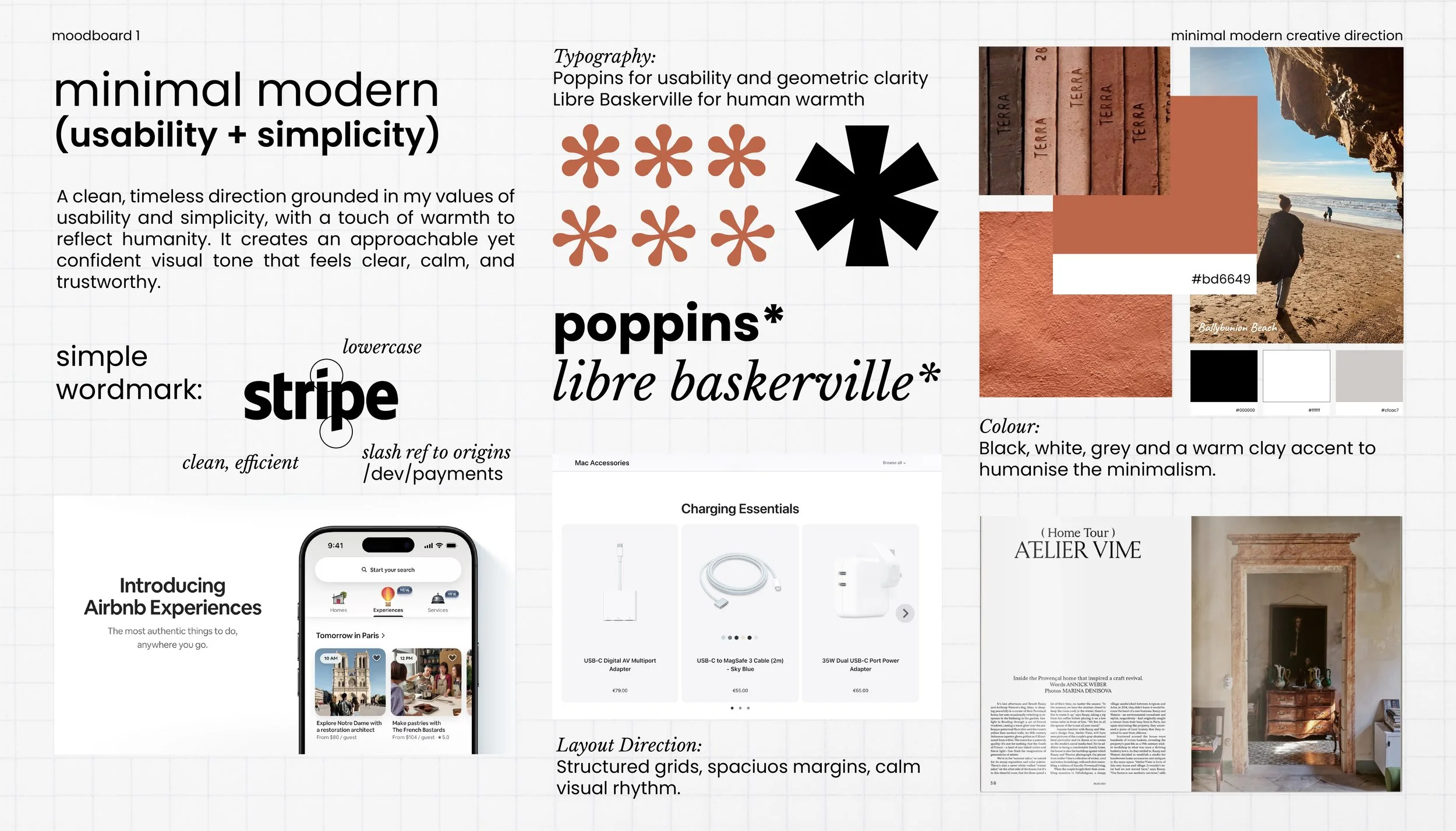
moodboard 1 minimal modern
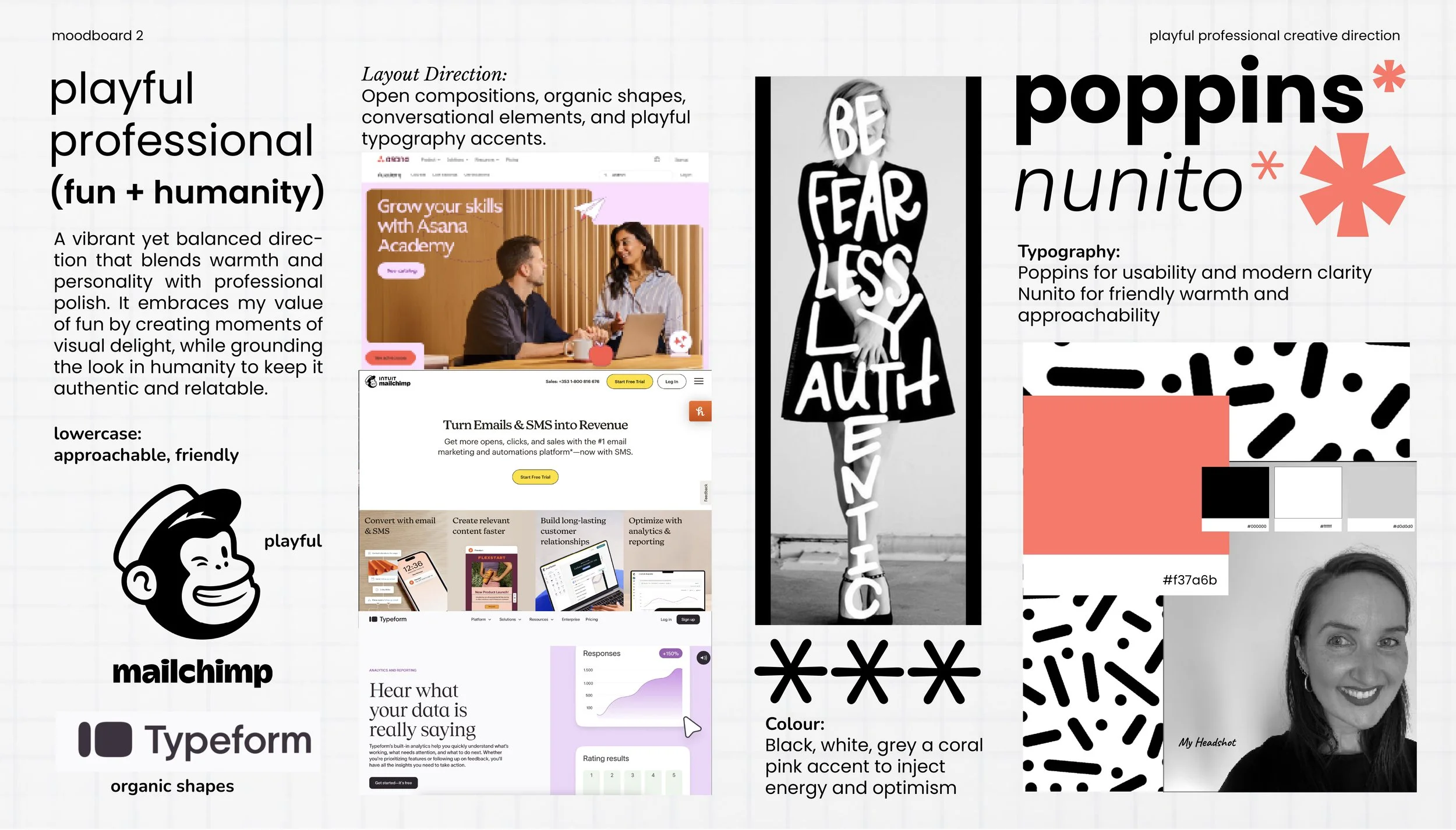
moodboard 2 playful professional
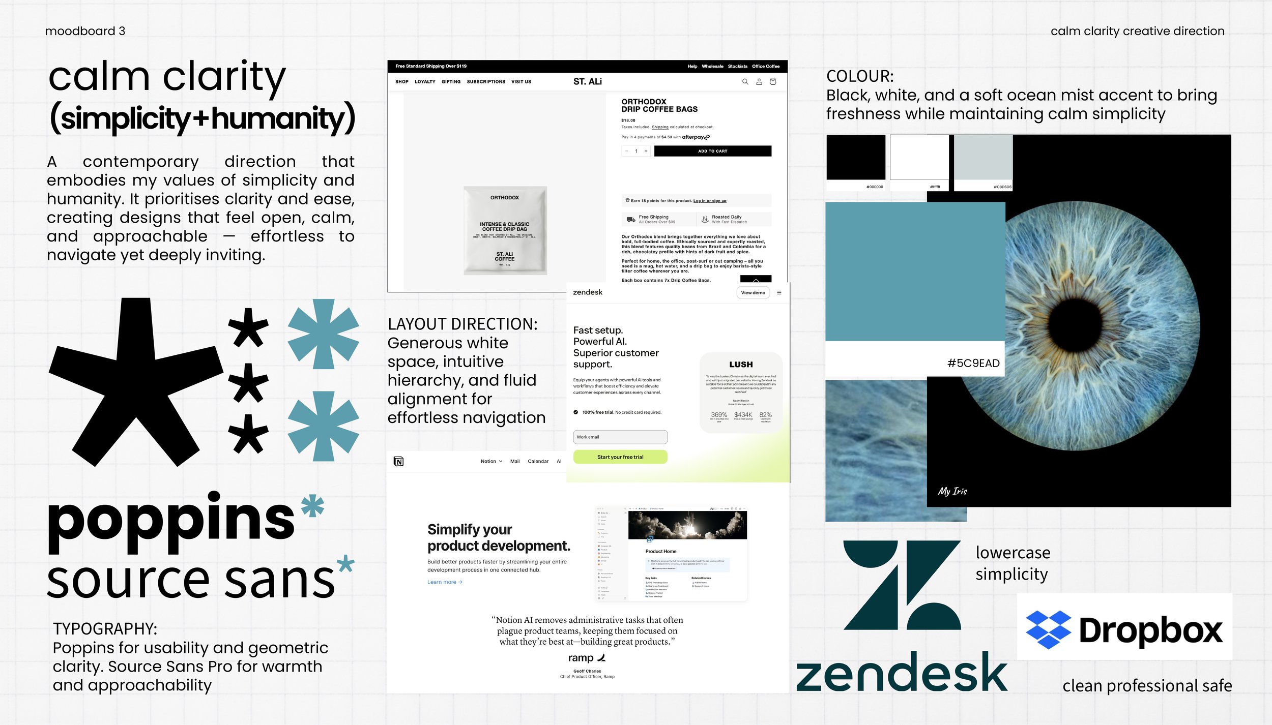
moodboard 3 calm clarity
Large orange graphic with a white arrow shape pointing to the right. Contains the text '4. visual identity' in light gray, with 'visual' in bold.
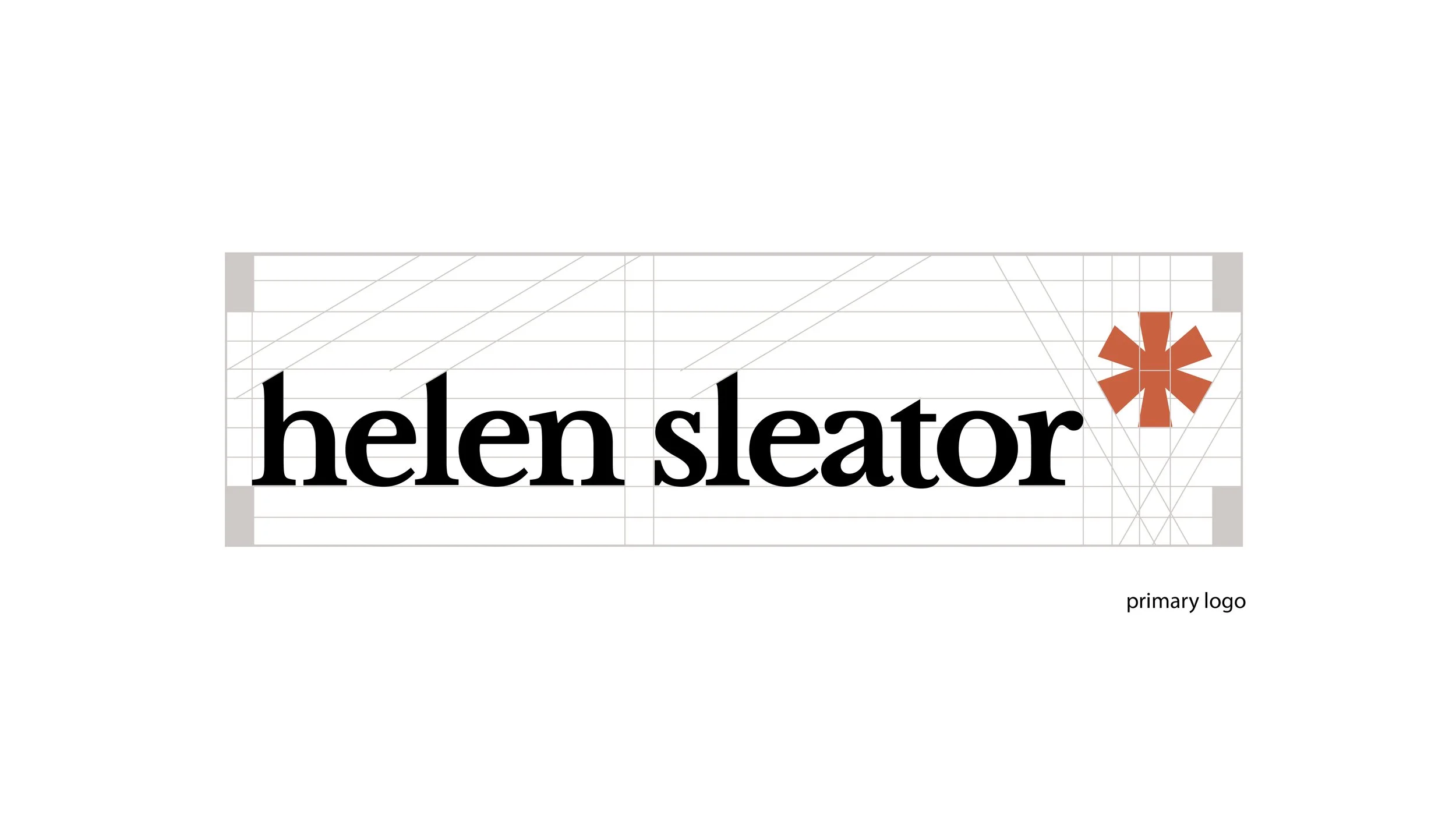
primary logo
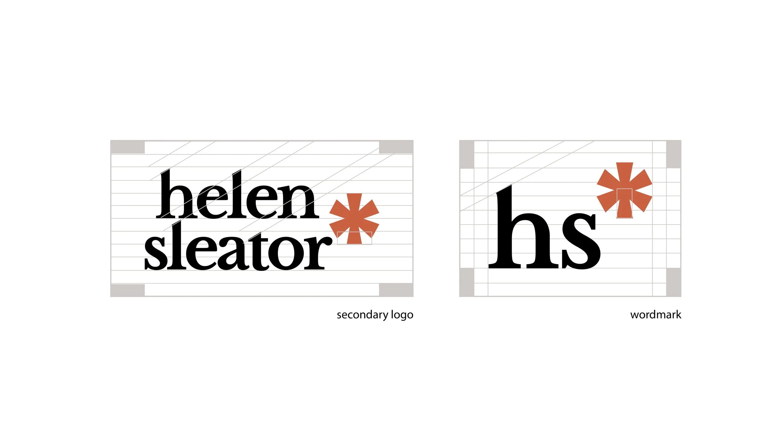
secondary and wordmark logos
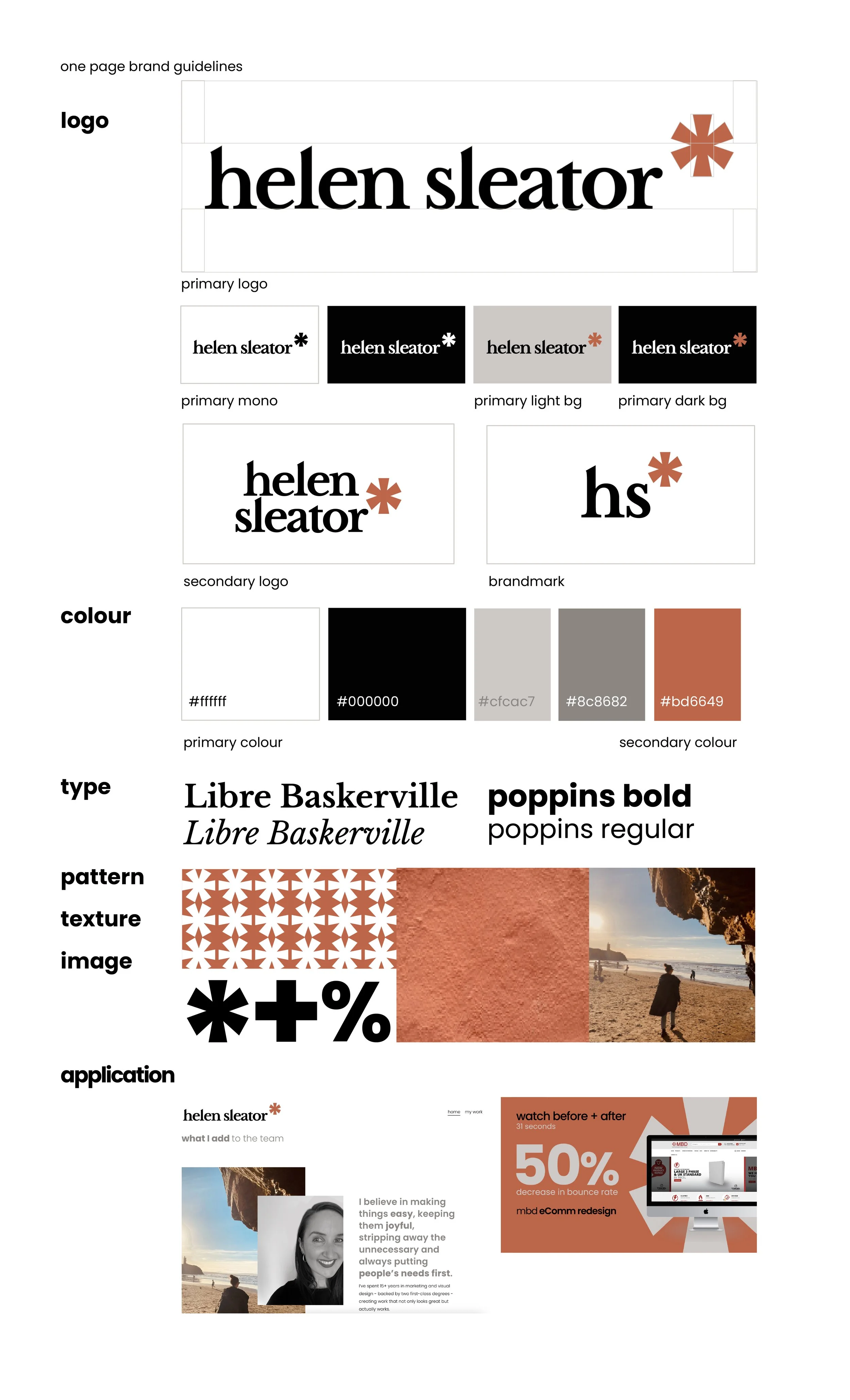
one page brand guide