
ux/ui sprint: Revolut homescreen clarity
-
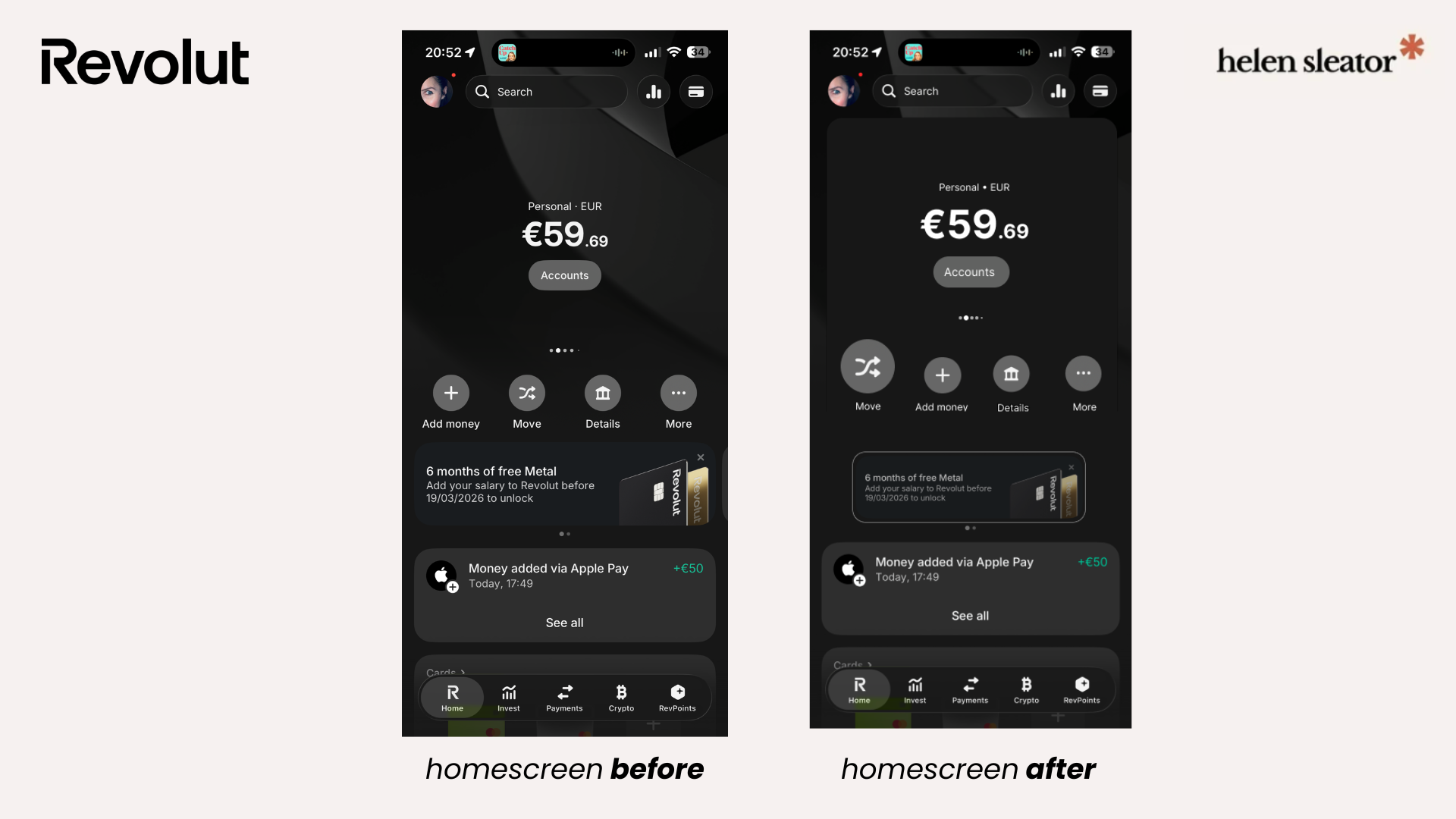
The home screen presents multiple primary actions and promotional content with equal visual weight, making it unclear which task should be prioritised upon entry.
-
Established a clear primary action (Move) through scale and emphasis
Reduced visual competition between actions and promotional content
Introduced clearer grouping to reinforce hierarchy without altering the existing system
-
No redesign of navigation or feature set
Existing visual language preserved
Mobile home screen only
-
Clearer prioritisation and faster user orientation within a feature-dense financial interface.
Note: Independent UX/UI sprint. Not affiliated with Revolut.