festival branding identity
client: Festival Brand Identity
role: Creative Director
-
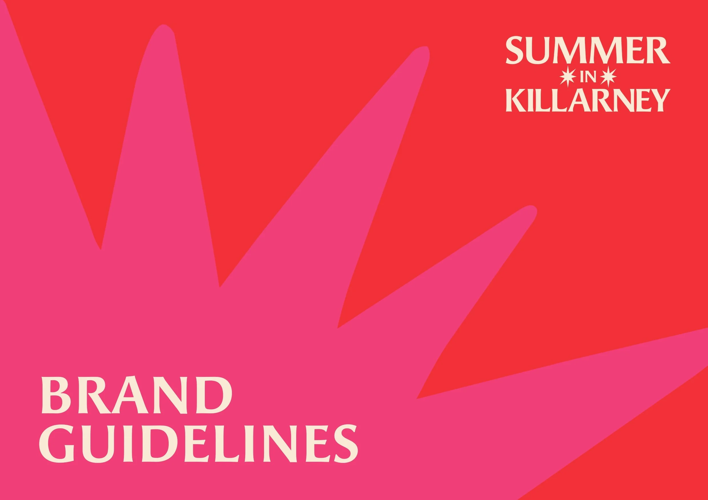
Festival Branding Identity
I was commissioned to create a distinctive visual identity for Summer in Killarney, a programme celebrating the town in full seasonal force: parades, horse racing, heritage events and outdoor cinema. The client, KCC, needed a brand that could hold its own across print, digital and street-level applications, while feeling immediately, instinctively alive.
-
The challenge was to distil the energy of an entire town at its most electric into a single, coherent visual language, one that could speak to a broad public audience across wildly different touchpoints: an A0 event poster, a social media carousel, a sponsorship banner in the rain. It needed to feel handmade and human, not corporate. Loud without being cheap.
-
As with any identity project, I began with strategy. I defined the brand's core character around three tensions that the festival itself embodies: nature and energy, community and spectacle, heritage and immediacy.
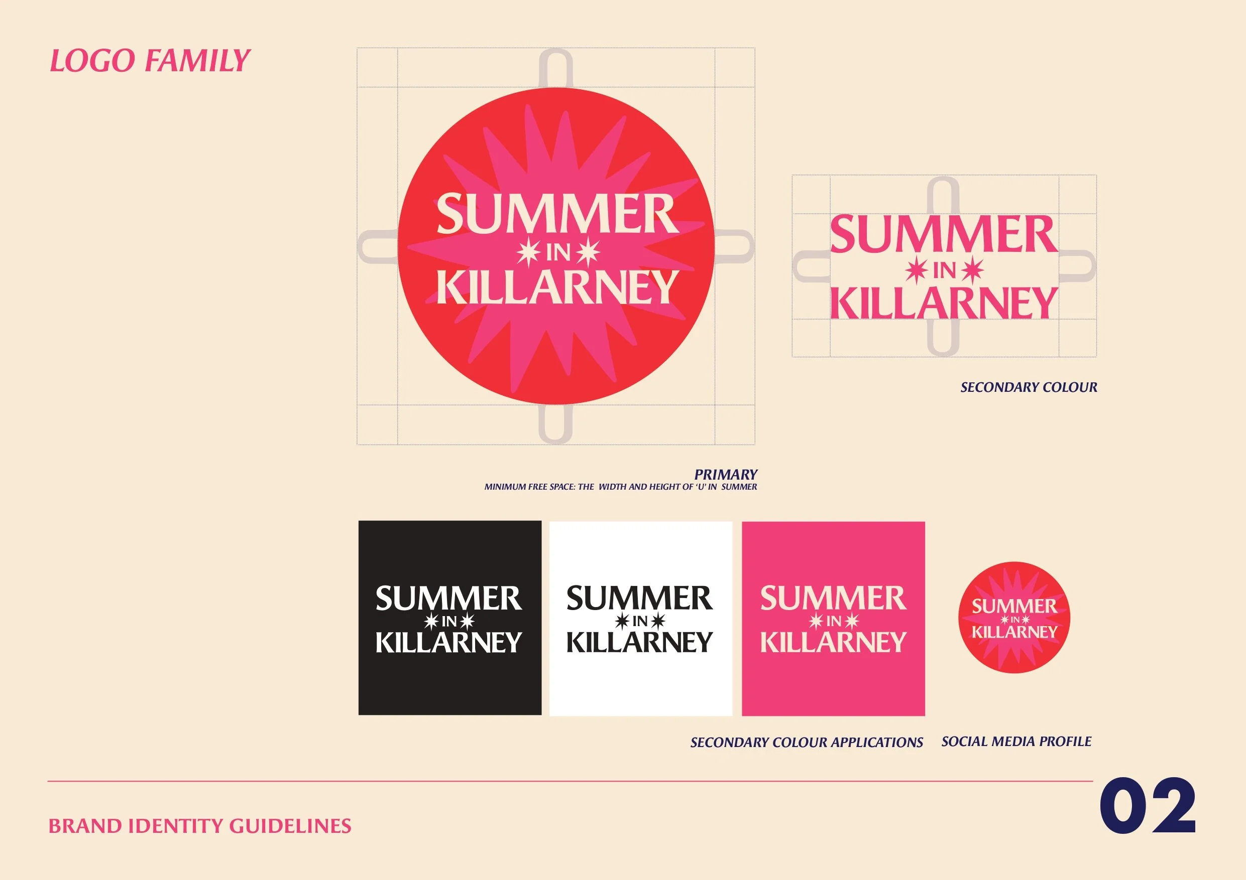
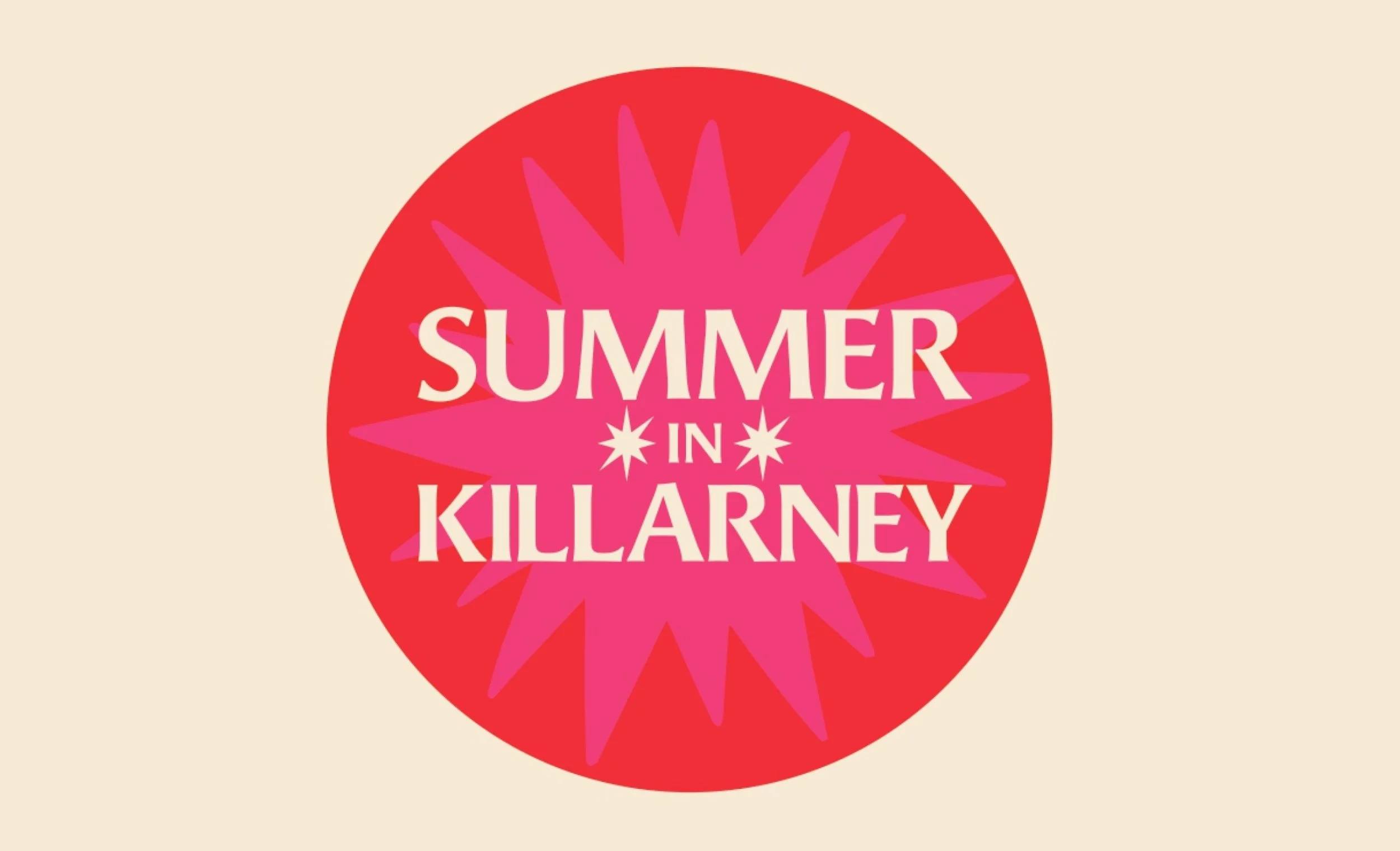
From this, a key symbol emerged: the sunburst. Rendered not as a clean geometric form but in an uneven, folk-art style that feels raw and expressive. Visually, it does what the festival does: it radiates outward, pulls focus, and holds its ground against noise. I paired it with a bold condensed wordmark set in high contrast against a blazing red field, with Pop Pink as the dominant accent, a combination that leaps off the page and pulses with the rhythm of long summer days.
The colour system was built for flexibility and joy. Three primary colours (Pop Pink, Riot Red and Creole Cream) anchor the identity. Six secondaries including Terrific Teal, Merry Moss and Golden Gold give the brand room to breathe across co-branded and seasonal applications.
Typography follows the same logic: Angie Sans STD Bold for headlines (expressive, characterful, high-legibility at scale), Futura Condensed Extra Bold for event text (urgent, punchy), and Futura Medium for body copy (clean and readable at small sizes).
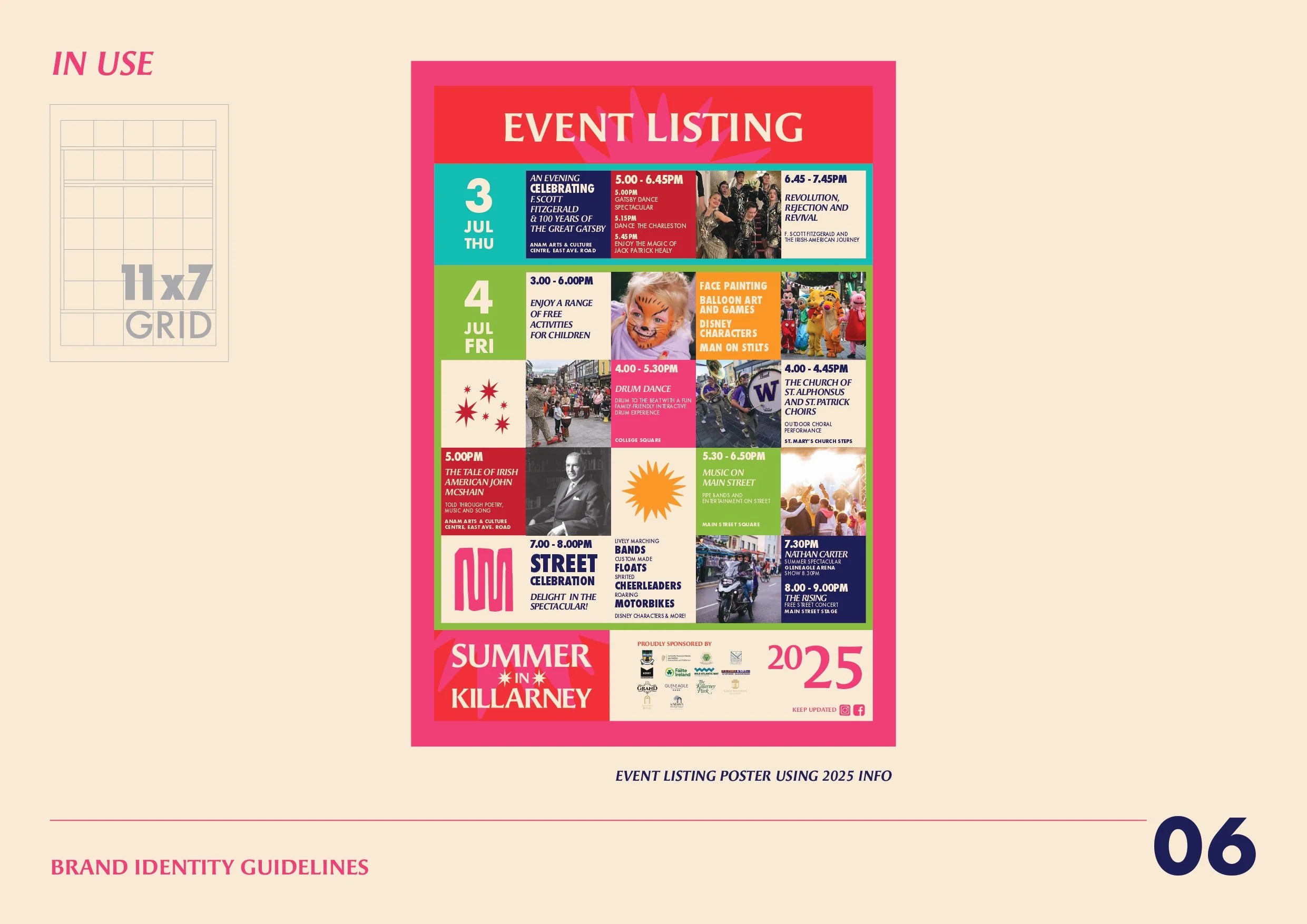
The brand asset library, covering mountains, lakes, forward arrows, a parade squiggle and a figure with arms raised, was built to be modular. Each element carries symbolic weight rooted in Killarney specifically, while remaining flexible enough to recombine across formats.
-
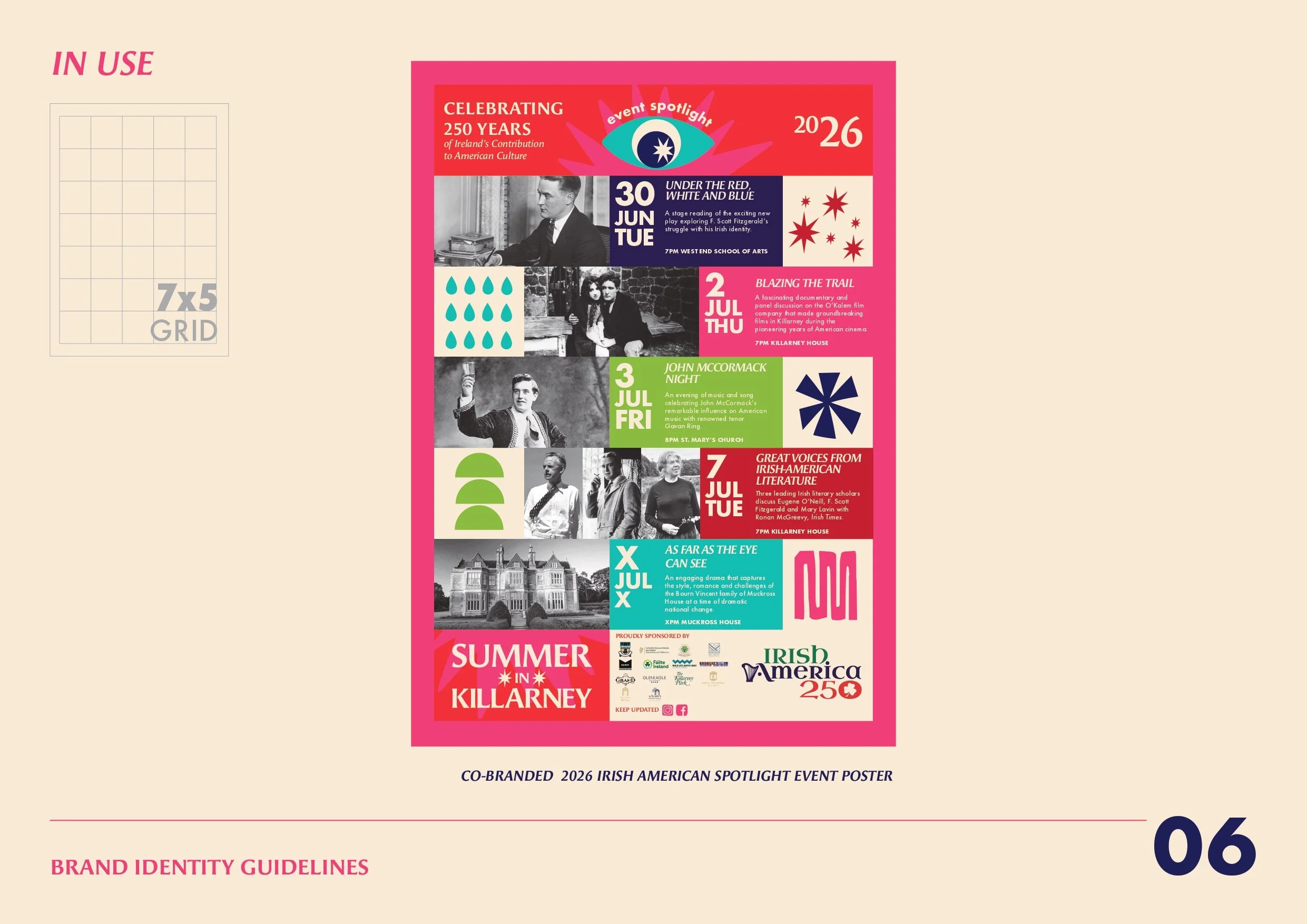
Deployed across print, outdoor and digital in 2026 and extended into a co-branded Irish America 250 spotlight series for the same year, it demonstrates how a strong visual foundation built on brand strategy, typographic rigour and a clear sense of place can flex to meet any brief thrown at it.