
MBD - streamlined shopping experience
project snapshot
-
client
meterboxesdirect.co.uk
-
users
B2C D.I.Y. Market & B2B Professionals
-
my role
Design Lead, Tricel. Strategy to UI, end-to-end. Collaborated with digital marketing executives and dev team in Ireland, managed UK client relationship, stakeholder presentations, dev handoff and iteration.
-
outcome
Streamlined shopping experience - simplified navigation, strategically redesigned product pages to build trust and reduce friction → 54% bounce ↓ 20% traffic ↑
the challenge
MeterBoxesDirect.co.uk is an eCommerce store selling meter boxes and appliances to DIYers (B2C) and small independent tradespeople (B2B).
The platform had become cluttered and inconsistent due to years of ad hoc updates on an outdated Magento theme. As a result, the user experience no longer supported the needs of its core audience.
Two distinct user needs emerged:
DIY customers struggled with product discovery and clarity
Independent tradespeople needed a faster, friction-free path to specific SKUs
This led to key usability issues:
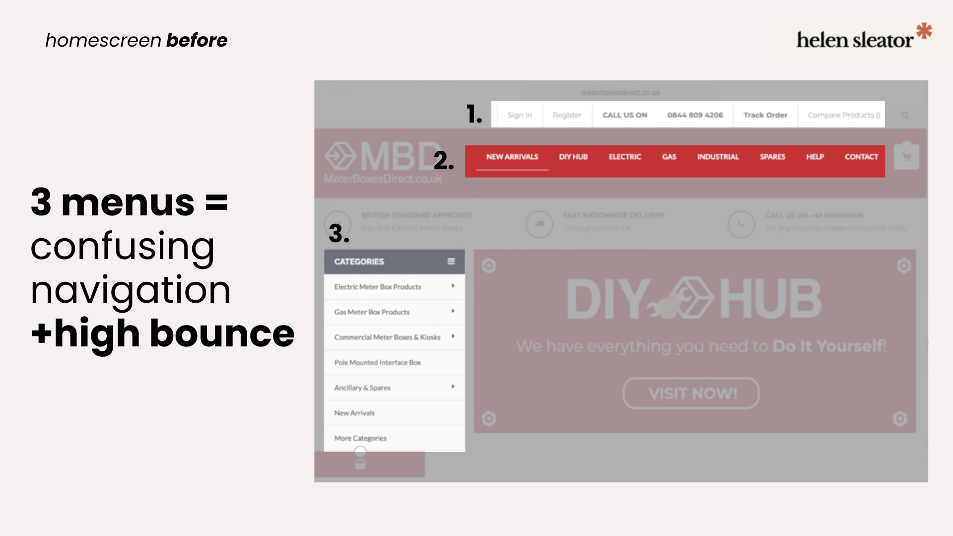
Duplicate menus and poor search made navigation frustrating
Inconsistent layout and visual noise created user distrust
These issues contributed to a 55% bounce rate (well over the average 20–45% for product-driven eCommerce), poor engagement, and stalled sales.
high bounce
Homepage navigation confusion
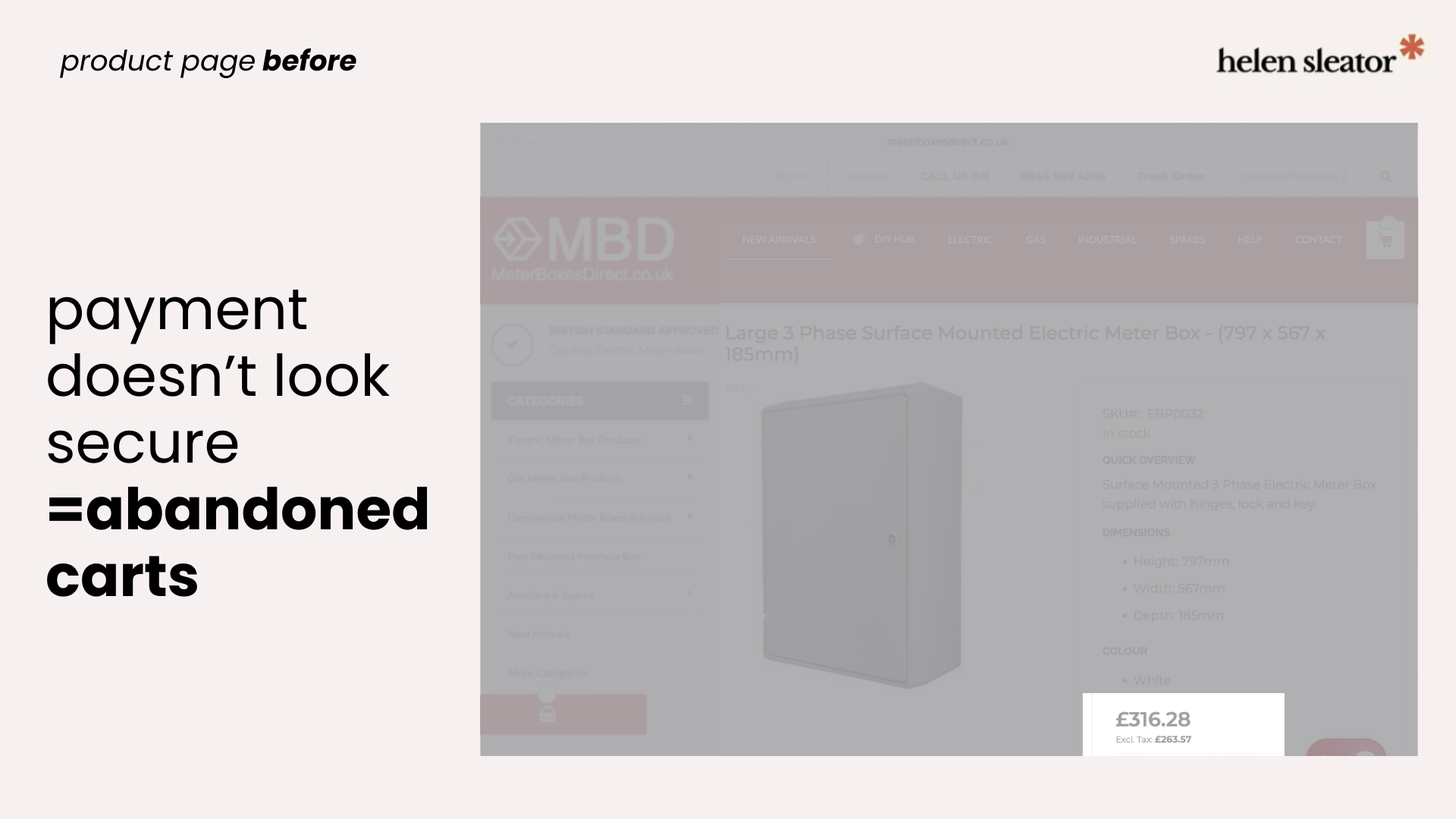
abandoned carts
Product page lacks credibility
my design strategy
Discovery
Working from customer journey maps, sitemaps, and Hotjar user recordings provided by MBD’s marketing executive, we identified key friction points across both user journeys and defined the core UX problems to solve.
Key decision
Working within budget and timeline constraints, the decision was made to customise a premium Magento theme rather than pursue a full rebuild — allowing us to deliver a significantly improved experience more efficiently.
Design approach
Theme evaluation
Audited five Magento themes for accessibility, responsiveness, and visual clarityNavigation redesign
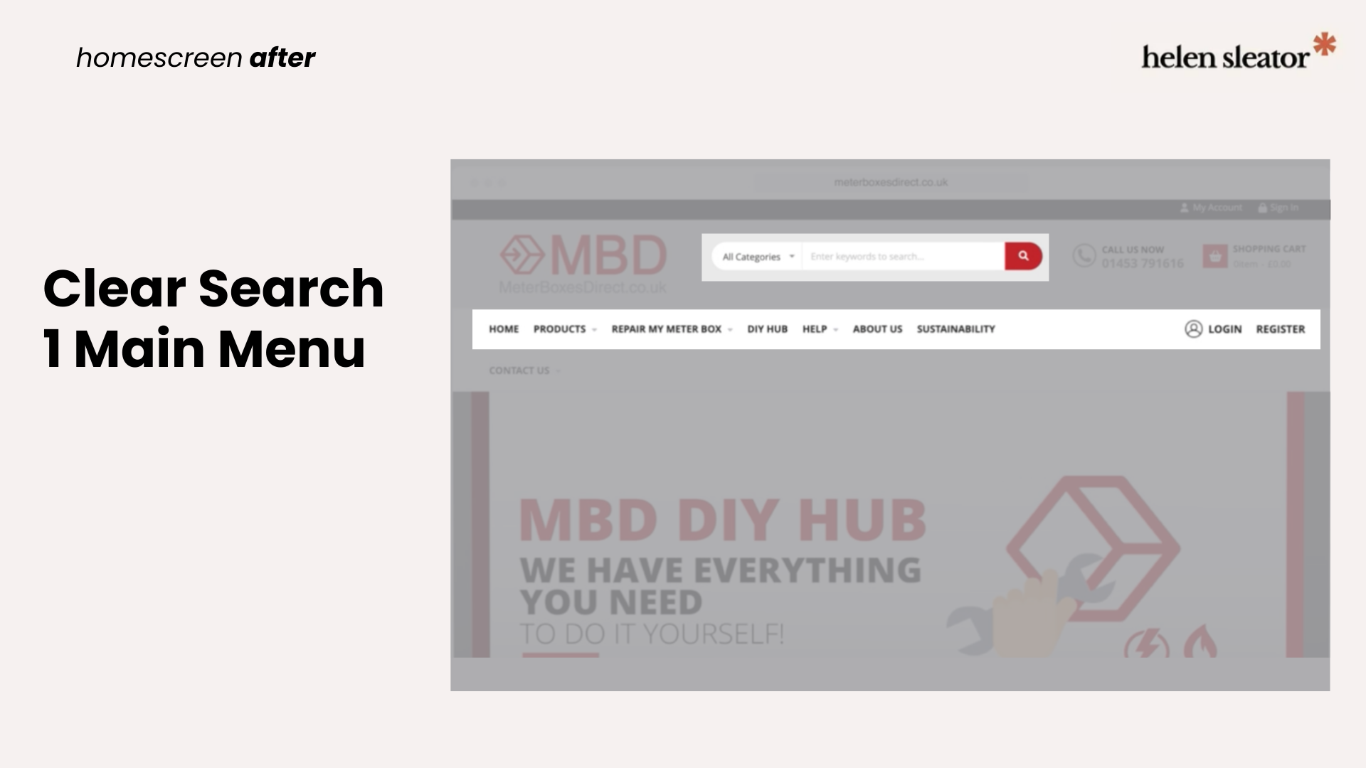
Consolidated three competing navigation systems and introduced a high-priority search bar for trade usersProduct page customisation
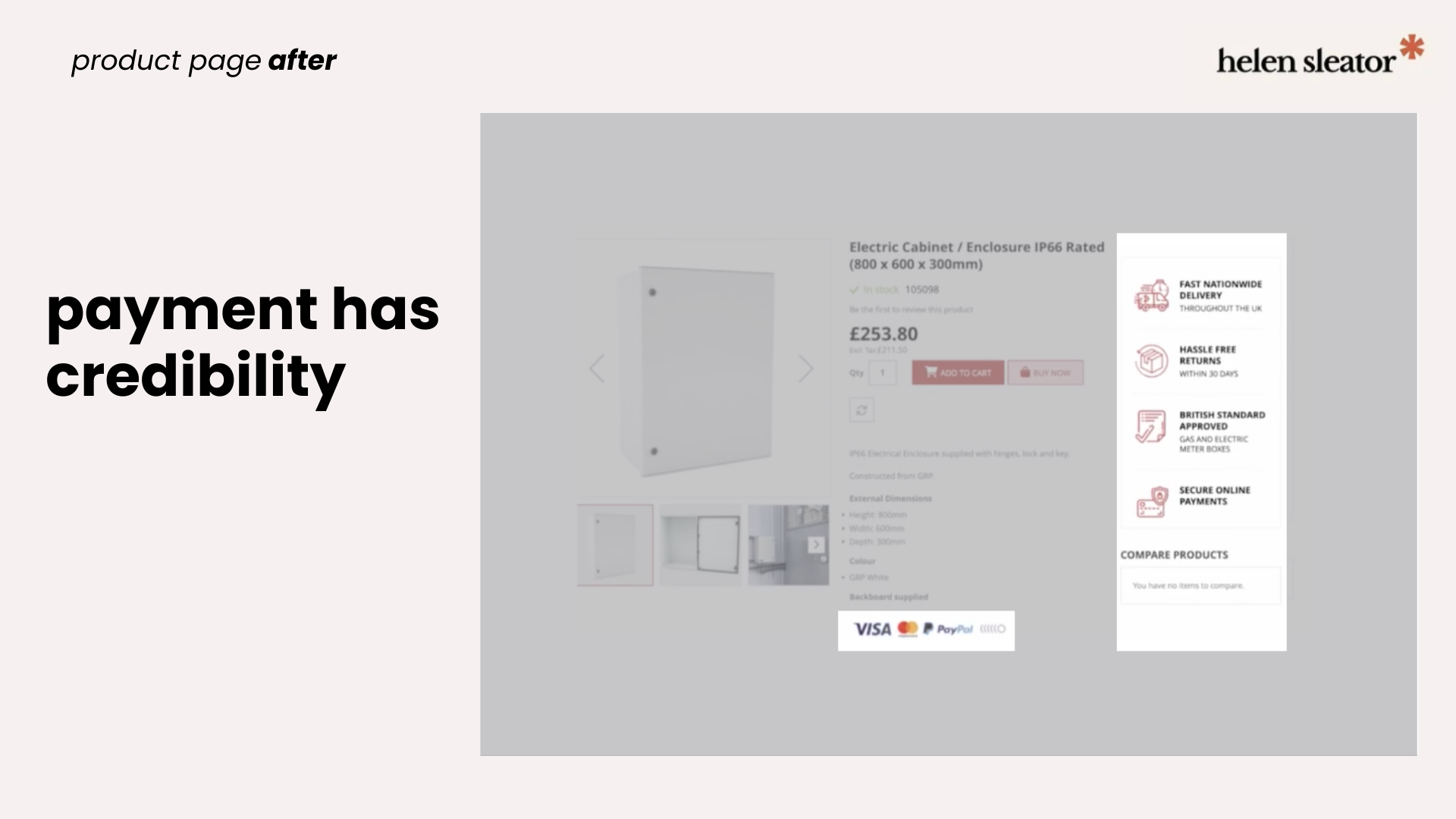
Added delivery and returns USPs and recognised payment icons to build trust and reduce cart abandonmentVisual refresh
Returned to the original brand palette to create a cleaner, more professional tone
Execution
Working in Adobe XD, I adapted the selected Magento theme to MBD’s brand identity, producing high-fidelity mockups and brand assets. Designs were presented to stakeholders before final developer-ready documentation was produced for a smooth handoff.
clear search & main menu
Distinct search icon for B2B users; easy menu for D.I.Y.ers
added trust signifiers
Product page now has recognised payment icons
results
Improved trust and reduced bounce
Rebuilding the product pages with delivery information, returns policy, and recognised payment icons removed key barriers to purchase — contributing to a reduction in bounce rate from 55% to 25%.
Stronger organic performance
UX improvements combined with an SEO refresh drove a 20% increase in organic traffic within months of launch.
Exceeded revenue targets
Sales surpassed annual revenue targets within months of the redesign going live.
Efficient delivery
The site launched within one week of design handoff.
54% reduction in bounce
20% traffic increase
reflection
Even within technical constraints, this project reinforced the impact of customer empathy and clear UX — showing how focused improvements can drive meaningful results.
With more time and flexibility, I would have explored a custom mobile experience from the ground up, rather than adapting a desktop-first approach.
next case study: simplified workflow